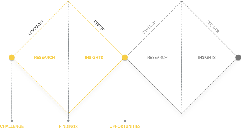
Since this exercise was focused on the first diamond of the design process, our goal was to identify problematic areas of the BikeMi service and ultimately define design opportunities that can later work as a design briefing for further improvements/to redesign the service.
In order to define problematic tasks, we had to start by trying out the app and service. None of us had an account, so we started by setting it up and then we tested out the whole process of getting a bike and locking it again in a different station.
This phase was very helpful to capture first impressions and have a clear picture of the information architecture and how the app also accompanies the user in physical interaction with the service.
Heuristic evaluation and Premo
What emerged from the heuristic evaluation is that the greatest criticality for the user is figuring out how to proceed between tasks. This affects the entire experience with the application and prevents the user from interacting in a smooth and intuitive manner.
It certainly does not help that there are many false affordances that increase insecurity in the user and the use of aesthetic choices that do not reflect standards.
The radar graph represents the heuristics most violated in the different phases analyzed.
Registering
Finding bike station - Unlock bike
Cycling
Locking the bike
Field Research
After identifying the most problematic tasks, the user analysis phase began. The process involved both qualitative and quantitative methods, to go in and identify users' tacit needs.
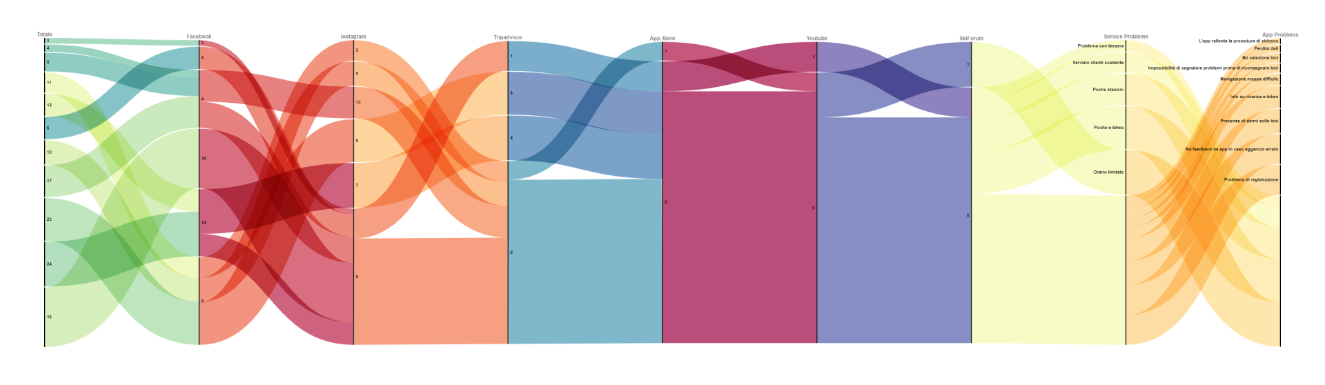
Digital Ethnography
Moving from the desk research to the expert evaluation, we identified some main problematic tasks that can affect the UX. Before proceeding with the structure of the questionnaire and the beginning of user testing, we decided to investigate any issues raised by the users through digital ethnography.
The results highlighted many problems regarding the information architecture and made understand us that the app is only useful for the map and for reporting damages.
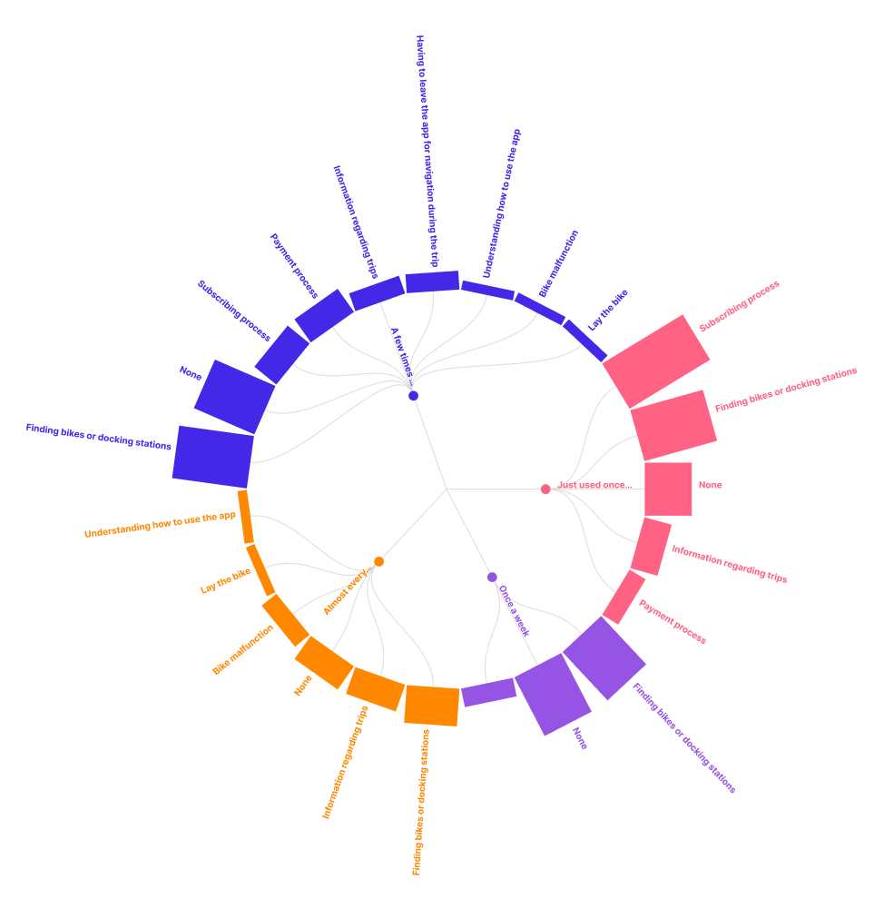
Survey
Thanks to the Digital Ethnography we were able to understand the main common problems that BikeMI users have experienced. This phase was very helpful in order to frame the survey questions and understand how the app impacts the quality of the service from the user's point of view.
We received 96 replies.
Observation
Our methodology in conducting the observations was to ask the users to accomplish few tasks without external guidance and observe the time taken for each task. As experienced users were already familiar with the app flow, they did not hesitate or have issues. But identifying the points that the new users struggled the most with was helpful in determining points to improve.
Analysing Emotional Responses
With consent, we have recorded and analysed users’ emotional responses while using the app. The goal of this analysis was to identify users’ emotional responses, beyond what they register. By gathering data on the change of facial gestures, we aimed to determine feelings frustration, confusion, satisfaction, while user is using different app pages. These responses can reveal the user engagement, potential usability issues and user satisfaction.
Interview
We conducted semi-structured interviews with experienced and new users after the observations. The interview questions were divided into 4 categories: user behaviour, information architecture, UI and UX and Feedbacks & suggestions.
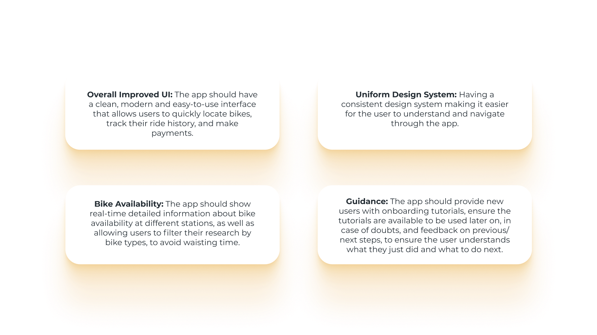
DESIGN IMPROVEMENTS
Card Sorting
In order to rebuild the information architecture of the App we proceeded with card sorting. Being a redesign and having to maintain standards, we preferred to use the closed method. In this way, while maintaining the division of the sections of the app, we would focus more on the mental model of the user, to understand where, in which of the assigned categories, they would expect that type of information.
Tree Testing
After card sorting results we structured the tree testing, an important tool for information architecture design. We relied on Optimal Workshop to conduct the test because it allowed us to easily share the test and analyze the results.
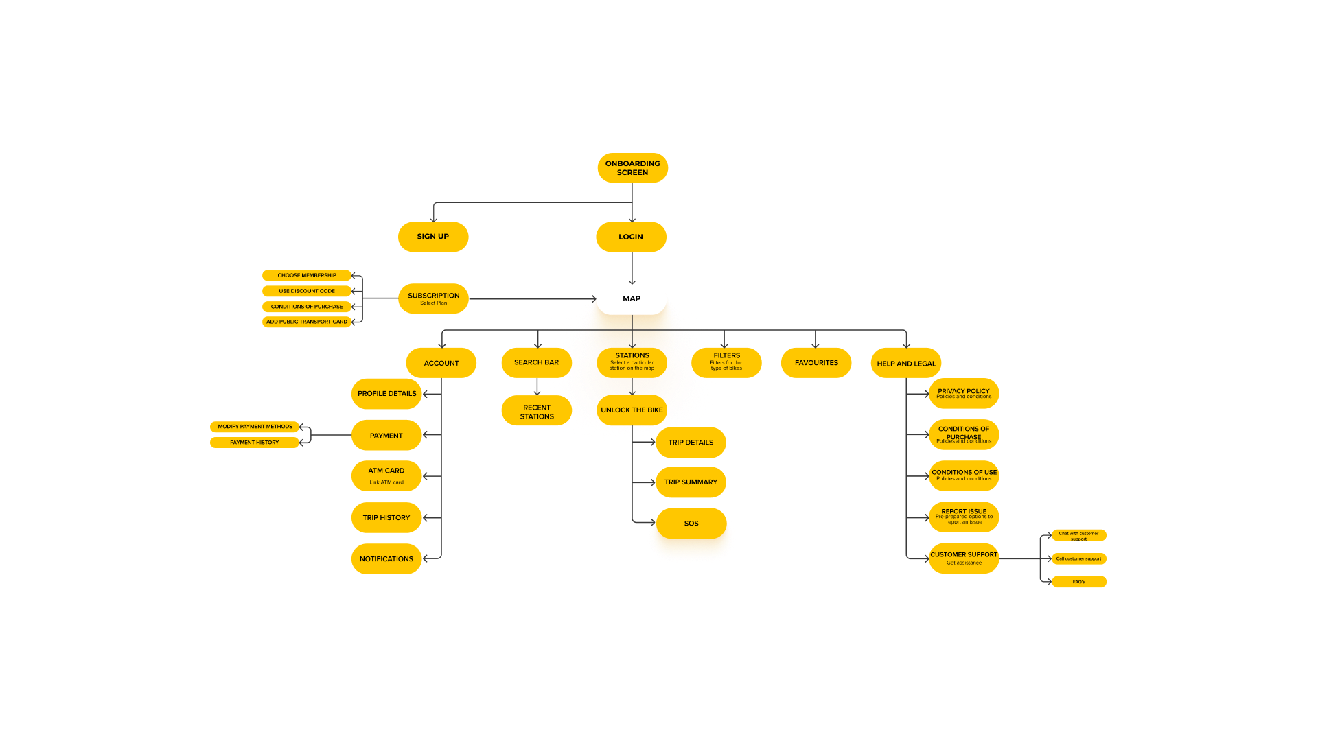
Overall, the combination of card sorting and tree testing allowed us to create a new information architecture for the BikeMI app that is user-centered, intuitive, and optimized for findability.
Information architecture
Wireframes
28 users were asked to complete 9 tasks without external guidance while thinking aloud, and commenting their satisfaction level for each one.
After analyzing and comparing the first testing results, some improvements to the previous designs were made and we decided to conduct a second phase of testing.
The second phase was mainly focused on correcting previous issues and making sure the corrections made were the right solution, before moving on to high-fidelity.
Mockups
To test the look and feel of the app redesign we did a more informal type of iterative testing process with some classmates.
We started with a simpler version, very close to the wireframes version, and slowly progressed to a more detailed version of the prototype.
The first version didn’t integrate a design system yet, but simply a more detailed version just to test the overall design feel.
After integrating the design system components and improving the overall design, we asked some colleagues for feedback and made some changes based on it.
This was an iterative process, where we asked for opinions, made some adjustments, and repeated the process a couple of times until we felt the design was ready to go and we could proceed to the prototype.
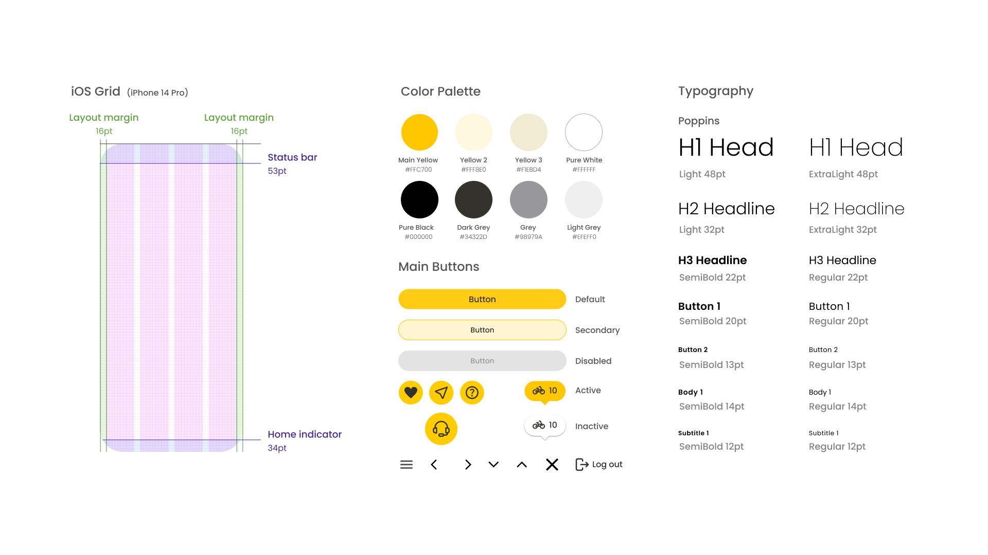
Having generated our design system and applied it in the creation of the prototype, we moved on to a testing phase to resolve some doubts about the visibility of some elements, their arrangement, and especially usability.
In total, we reached 20 people, including 8 BikeMI users. The test was performed using Maze, which was instrumental in analyzing the results, keeping the same tasks used for testing mockups.
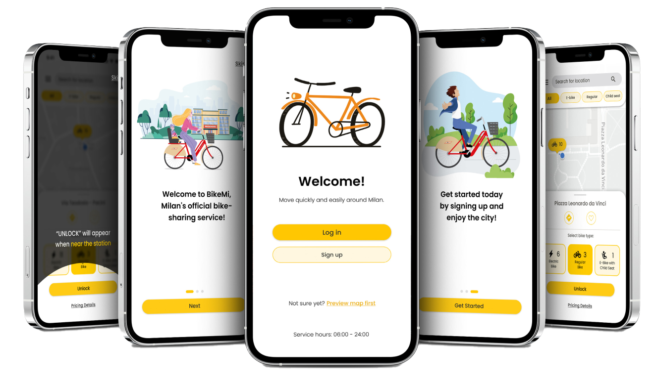
Hi Fi Prototype
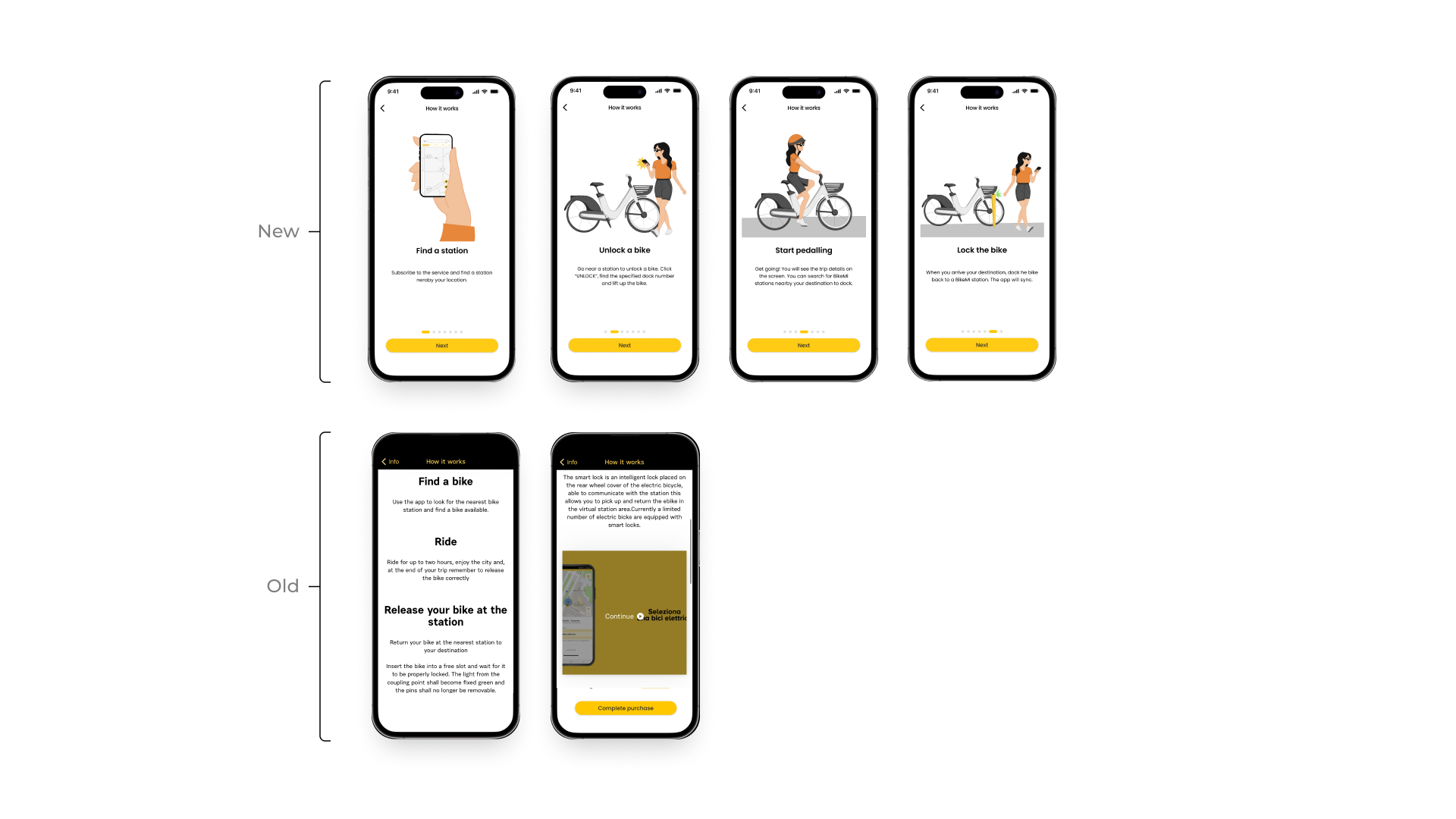
"How to use" section
Old - Too text heavy and hence, understanding information was tedious and confusing.
New - Visual cues along with text give a much easier grasp of the whole system.
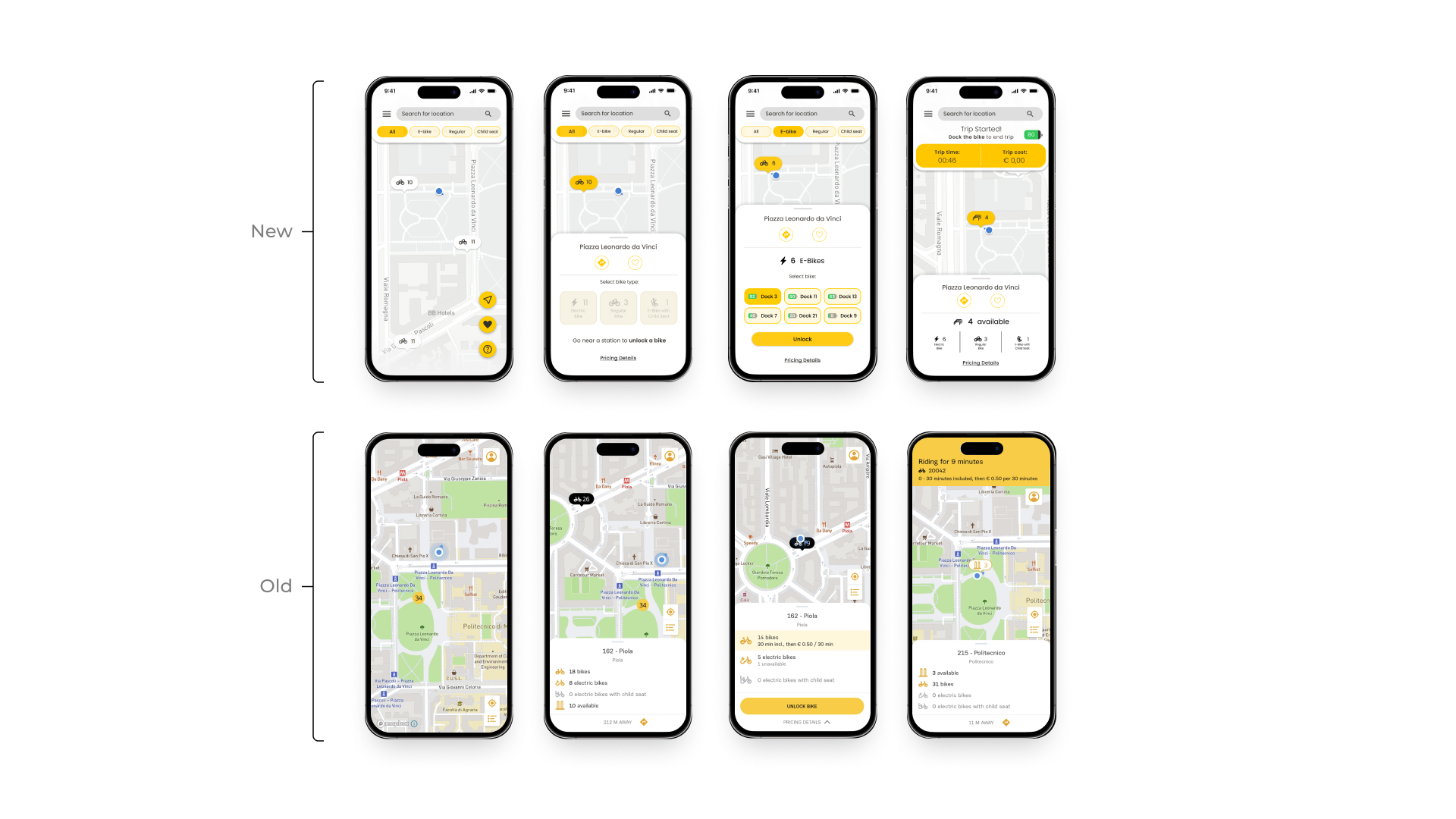
Unlocking bike & Ongoing Trip
Old - Visually cluttered and not intuitive along with confusing navigation due to the lack of a consistent design system.
- Lack of relevant information for the user during rides.
New - Consistent design system and visual hierarchy for easier navigation and access to relevant information.
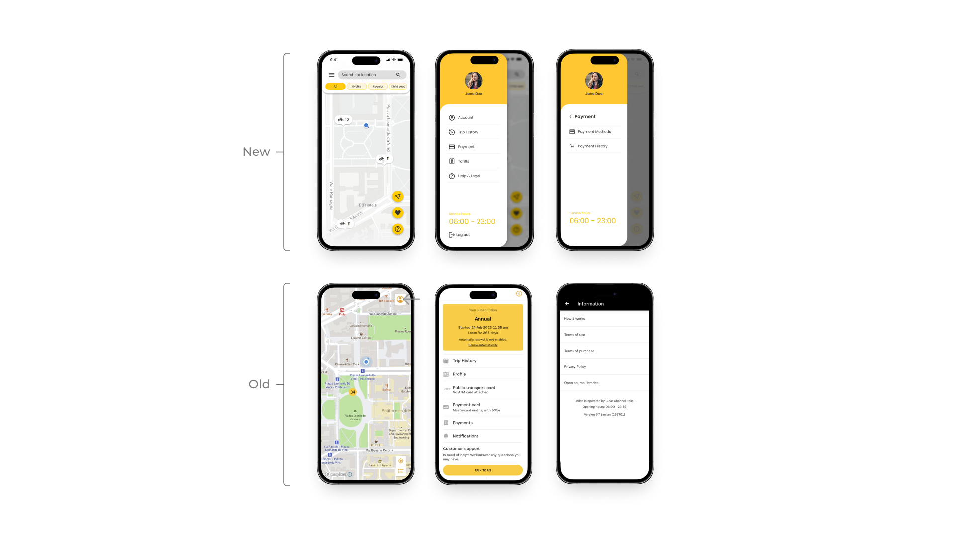
Menus
Old - The menu was packed with various options and features that made it confusing. Lack of segmentation of similar features. The menu button was also not very intuitive.
New - Use of appropriate icons and hierarchy. Cleaner design to help the user reach the intended section easily and intuitively.
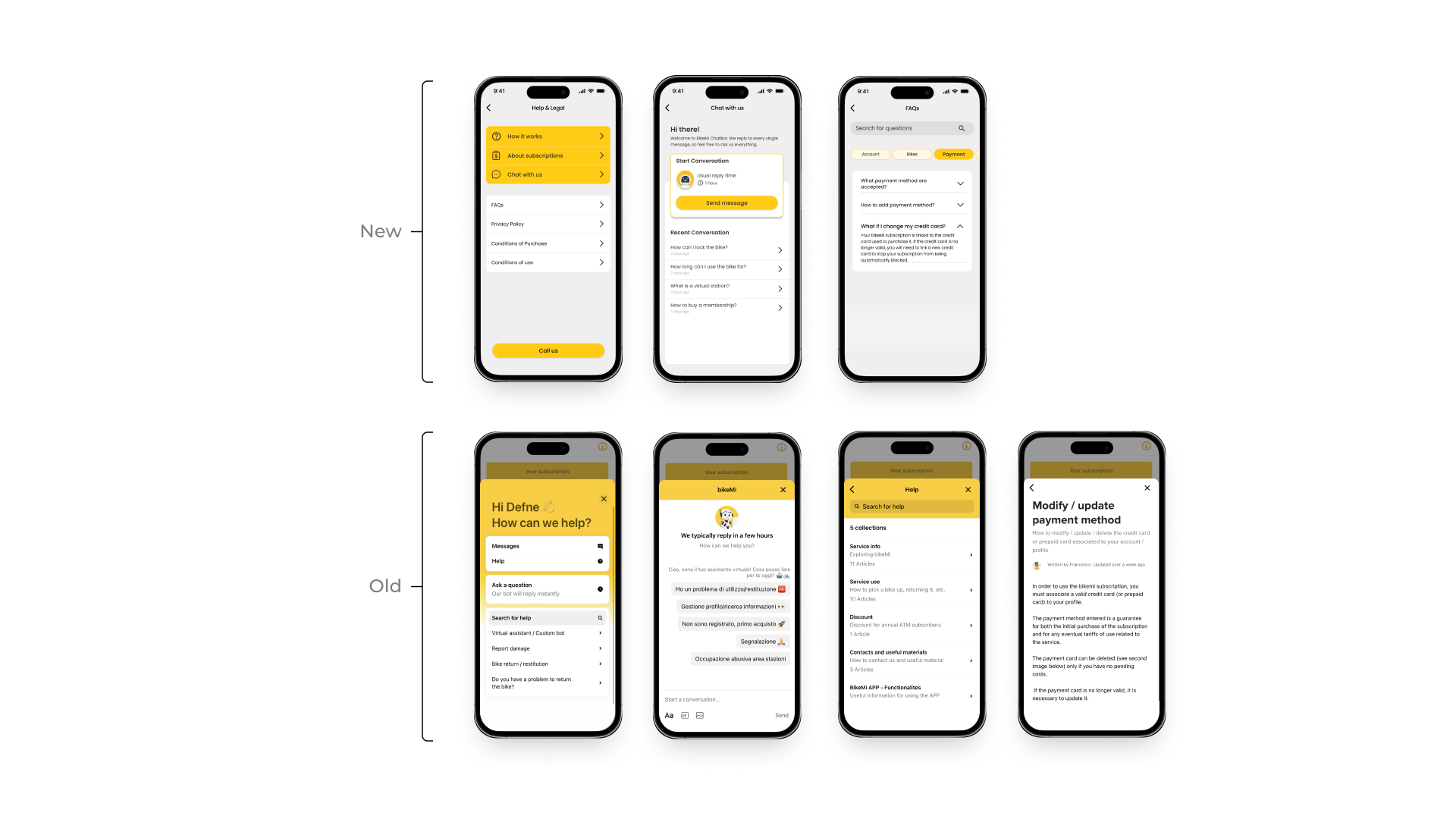
Help & Legal
Old - Several options lead to the same screen making the app flow confusing. The help section was chaotic and packed into a small section.
New - Organized structure and segmentation for a better user experience. Finding relevant information is also made easier with better labels and hierarchy.
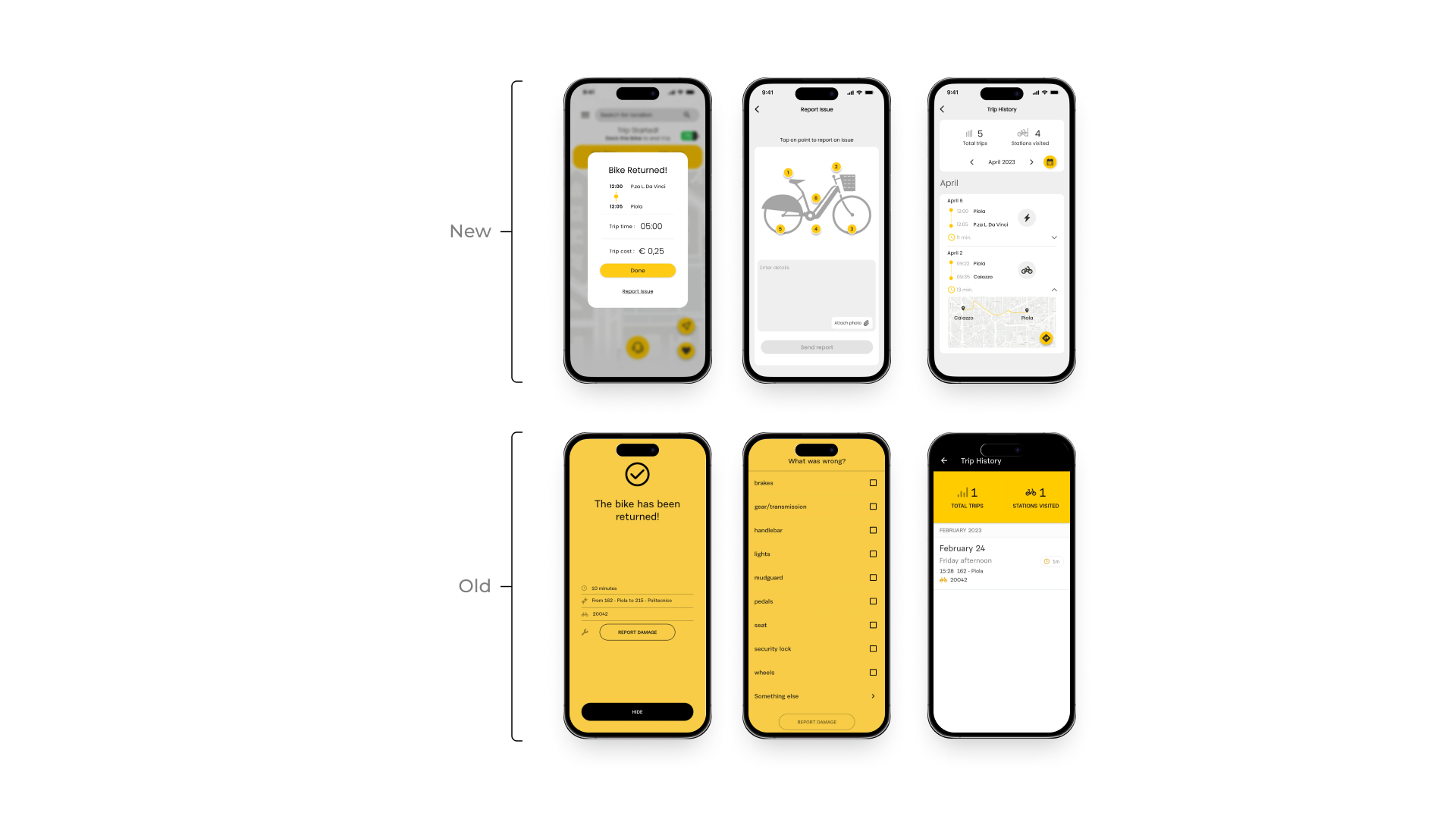
Reporting Issue & Trip History
Old - Reporting issue was non-intuitive and for a novice user, it was difficult to understand. Trip history was not informative and no way to understand where the stations were.
New - Improved visual interface for the user to report damages without having to understand which part of the bike was called what. The user can also go to specific stations from the Trip History and also open the path taken in Maps.